Project 05 · Commercial Construction
XL Construction
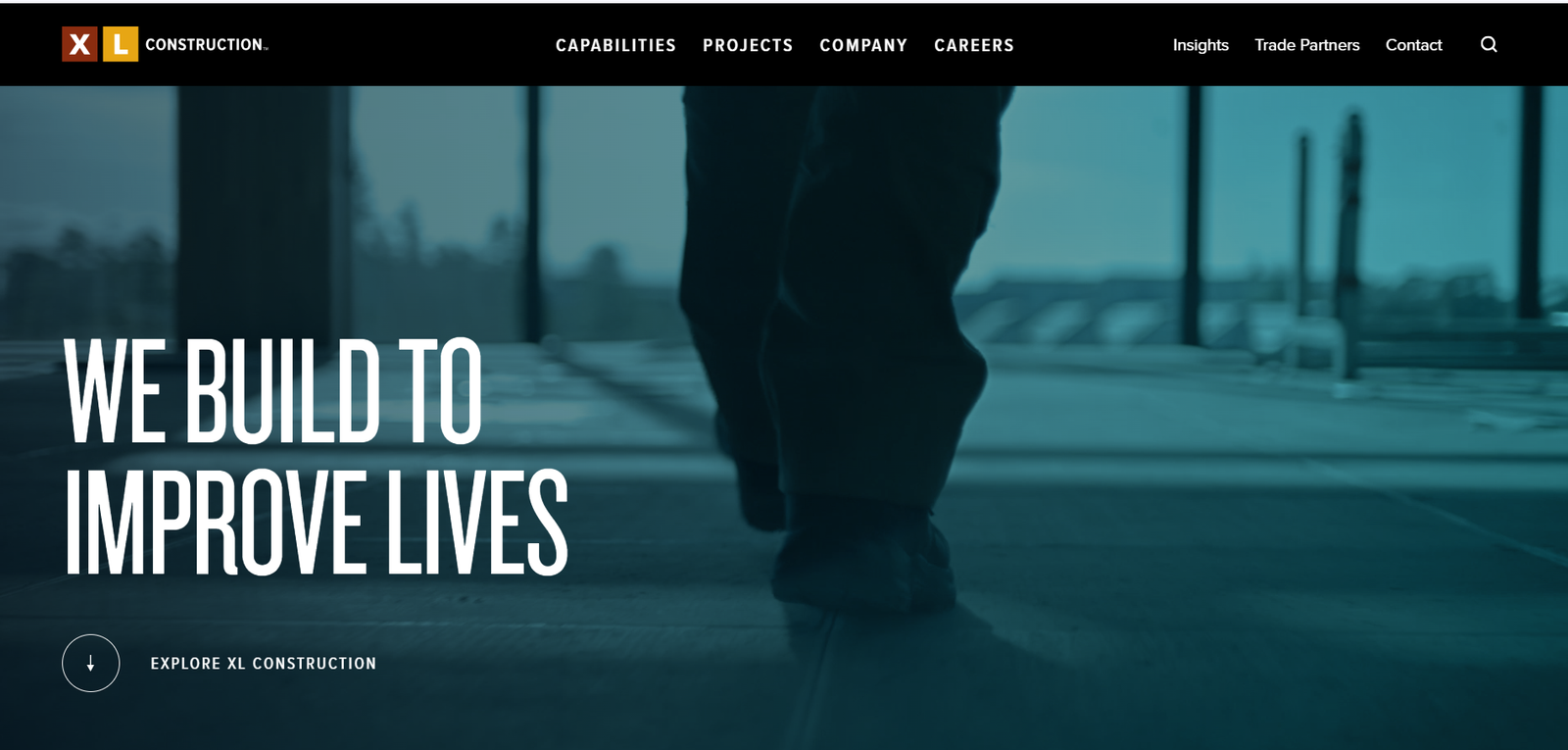
We Build To Improve Lives a corporate web presence that matches the scale, ambition, and integrity of one of the Bay Area's most decorated builders.
We Build To Improve Lives a corporate web presence that matches the scale, ambition, and integrity of one of the Bay Area's most decorated builders.
XL Construction is an ENR award-winning general contractor operating across the San Francisco Bay Area. Their market sectors span advanced technology campuses, civic institutions, educational facilities, healthcare centres, and life sciences laboratories each demanding the highest standards of precision and project management.
The brief was to create a corporate website that communicated the breadth of their capability while keeping their human mission central. We designed a bold, photography-forward experience built around the ethos "We Build To Improve Lives" with deep sector pages, an insights hub, and a structured trade partner portal that streamlines their operational partnerships.
The new site increased trade partner applications by 240% and became the company's primary tool for pitching new market sectors to prospective clients.
.png)
.png)
.png)
.png)
.png)
XL Construction operates across 6 distinct market sectors and multiple service lines. Their old website presented a flat, corporate experience that buried their award-winning project portfolio and failed to communicate the depth of their integrated construction capabilities to sophisticated institutional clients.
We designed a sector-indexed architecture where every page begins with photography of real XL projects and leads through capability storytelling before reaching credentials. The dark teal and orange brand palette drives visual authority, while a persistent "Explore XL" CTA anchors every scroll position. The Trade Partners portal was rebuilt as a dedicated pathway.
Trade partner applications increased 240% in the first quarter. XL began winning invitations to pitch in new market sectors previously inaccessible to them. Their Insights section became a B2B content hub cited by an industry publication within its first year.
A palette built from industrial steel, deep teal, and a double-brand accent that announces credentials before a word is read.